Part of building meaningful relationships is empowering our clients to leverage their data easily and efficiently. And that means offering them a way to completely customize and quickly visualize their metrics.
We understand how time consuming it can be to pull data consistently and that bottlenecks in reporting receipt can cause data to be outdated. Plus, data is oftentimes spread across a number of different sources with different stakeholders, and compiling these via spreadsheets can introduce a chance for human error.
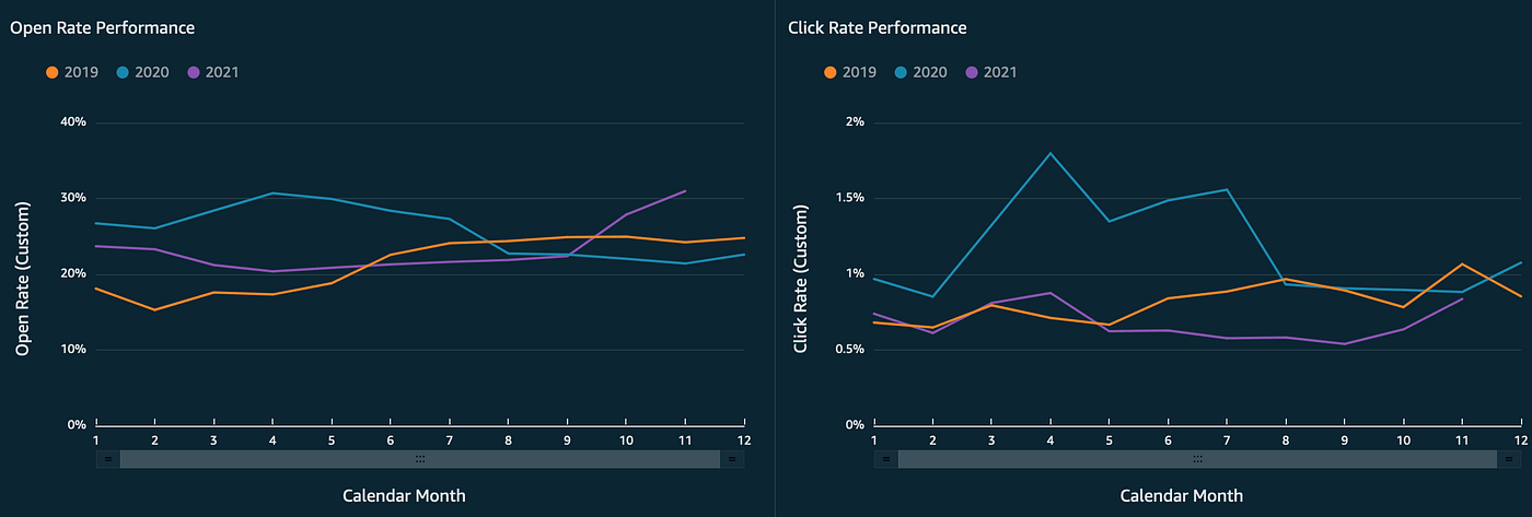
Enter Definitive Dashboard. Digital Additive created this analytics solution to help our clients see all of the information they need to maximize performance in one place, in real time. By providing our clients a tool to efficiently, accurately, and quickly transform email, social, and other communication data into meaningful metrics and KPIs they can understand at a glance, we can aid in their capacity to drive impactful strategy and decision making.
Definitive Dashboard offers a suite of capabilities including alerts for drops in KPI as well as historical data reporting as far back as the client needs. Nightly refreshes mean the information is always up to date, and customization and helpful filters ensure the client can easily access all of the information they need and can hide the information they don’t.
Core Capabilities:
- Nightly data refresh
- Easy-to-use Filter Tabs
- Pre-determined visualizations of email data
- Filters to manipulate visualizations
- Ability to download, schedule, share
- Viewer & editor restrictions
- KPI alerts
- Ability to add custom data sources and visualizations
- Ability to create or add custom email measurements (e.g. click rate on open, conversion rates)
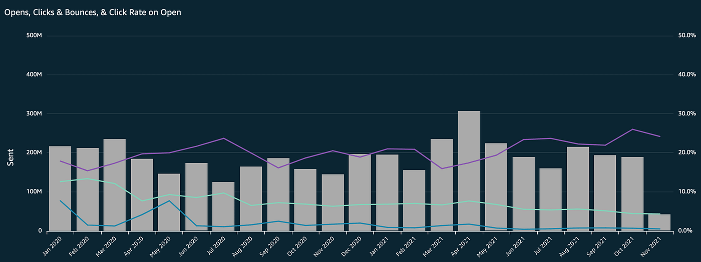
Here’s an example of one of the many visualizations Definitive Dashboard offers. On this page, you can see the Sent, Bounce, Open and Click Rate on Open performance by month in a double axis graph format. This view offers insight into trends and possible spikes in send count or bounce, open or click rates. Spikes are more pronounced and clustered depending on the timeframe tab chosen (the example above is set to an almost two yearly view.)
Ready to see if Definitive Dashboard is right for you? We’d love to explore how this visualization platform could transform your engagement strategies. Contact us today.